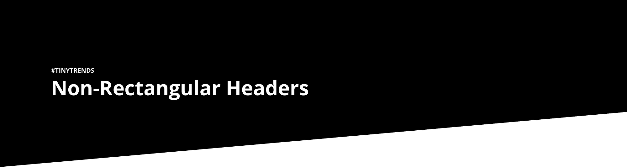
Ultimate Guide to Non-Rectangular Headers
Non-Rectangular Headers have recently been taken over the web. This “new” design trend seems simple and straightforward at first, but can be a little tricky to accomplish.
Non-Rectangular Headers have recently been taken over the web. This “new” design trend seems simple and straightforward at first, but can be a little tricky to accomplish.
Jon Moore recently put together a collection of some design styles he’s come across with non-rectangular headers.
As it happens, I’ve also been tinkering with diagonal headers over the holidays (what else do you do with all your free time?)
So, for some more fun, I’m going to tackle a variety of those design approaches, provide all the possible methods to achieve them (in pure CSS) along with a detailed comparison, comparing simplicity, portability, cross-browser support, and performance!
Part 1: Pure CSS Diagonal Separators
This is likely the most popular design choice for non-rectangular headers, and so there has been a large number of articles and posts that explore different methods to achieve this effect. However, most seem to focus on the end result, rather than providing a flexible approach that is both responsive and customizable.
The most common example, is perhaps demonstrated by Jon’s article’s own image:
We’re going to aim to build a separator that fits the following criteria:
✔ Simple CSS
Will the CSS styles be simple to construct in both vertical & horizontal flavours, and are they easily re-usable anywhere on the page (not just as a header)?
✔ Generated Content:
Can it be created with generated content (::before & ::after)? or does it require hardcoded HTML Elements?
✔ Cross Browser Support
Will it function across all browsers (desktop & mobile) Without any polyfills or JavaScript support?
✔ Performance
The most important criteria! we’re looking for painting time below 100ms as a benchmark.
Comparison Matrix
| Method | Simple CSS | Generated Content | Cross Browser Support | Performance |
|---|---|---|---|---|
| Borders | ✔ | ✔ | ✔ | ✖ |
| Gradient Background Image | ✔ | ✔ | ✖ | ✔ |
| CSS Shapes | ✖ | ✖ | ✖ | ✖ |
| SVG Background Image | ❓ | ✔ | ✔ | ✔ |
| SVG Mask | ✖ | ✖ | ✖ | ✖ |
| CSS3 2D Transforms | ✖ | ✖ | ✖ | ✖ |
Results
Simple CSS
- 1st Borders
- 2nd Gradient Background Image
- 3rd CSS Shapes
Generated Content
Cross Browser Support
- 1st Borders
- 2nd SVG Background Image
- 3rd CSS Shapes
Performance
For more details, please consult the code repository on Github, which includes further examples.
Diagonal Separators are just one of many design styles, what should I tackle next? Tweet me with suggestions!
Notes:
- CSS Variables are used in the code snippets blow for demonstration purposes and future prosperity, they are yet to be supported across all browsers and rendering engines!
- reversed & vertical variants listed below are verbose for demonstration purposes
- for simple multi directional classes, use the rotate() function as needed
- inspect the styles used in each method for a detailed example_
- Use with transparent colors (e.g. to overlay an image, or content) will require
absoluteor manual positioning: - see the repo for a detailed example
Borders
✔ Simple CSS
.separator {
  width: 0;
  height: 0;
  border-style: solid;
  border-width: var(--height) var(--width) 0 0;
  border-color: var(--top-color) var(--bottom-color) transparent transparent;
}
Reversed
.separator.reverse {
  border-width: var(--height) 0 0 var(--width);
  border-color: var(--top-color) transparent transparent var(--bottom-color);
}
Vertical
.separator.vertical {
  border-width: var(--height) var(--width) 0 0;
  border-color: var(--left-color) var(--right-color) transparent transparent;
}
Reversed Vertical
.separator.vertical.reverse {
  border-width: 0 var(--width) var(--height) 0;
  border-color: transparent var(--left-color) var(--right-color) transparent;
}
Notes:
- 👍 The angle is controlled by the element
heightvalue - 👎 Cannot be used with percentage measurement unit (
%), any other unit is valid: (cm,em,ex,in,mm,pc,pt,px) - 👎 For use in a full width or height scenarios matching the viewport, use viewport units: (
vw,vh,vmin) - 👎 Further control is limited (e.g. creating a shadow effect using
box-shadow)
✔ Generated Content
Can be used with the ::before and ::after pseudo-elements to generate HTML content for the separator without directly modifying your DOM.
Example
section {
  ...
}

section::after {
  content: '';
  display: block;
  width: 0;
  height: 0;
  border-style: solid;
  border-width: 50px 300px 0 0;
  border-color: yellow black transparent transparent;
}
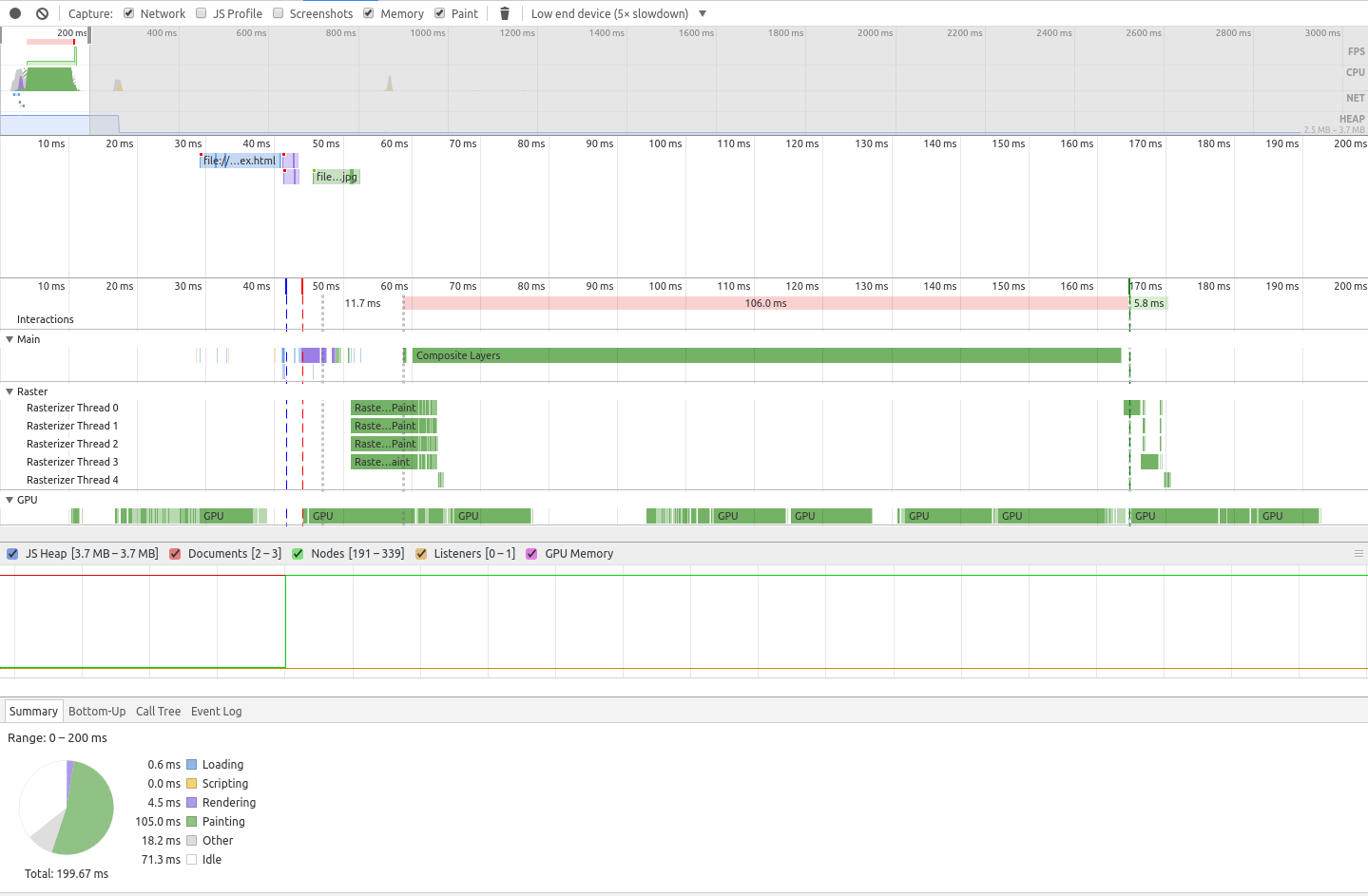
✔ Cross Browser Support
✖ Performance
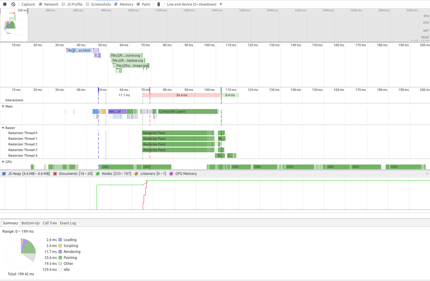
Clocking in a paint time of 105ms , this doesn’t quite reach our benchmark, but is not a bad result!
Gradient Background Image
✔ Simple CSS
.separator {
  width: var(--width);
  height: var(--height);
  background-image: linear-gradient(to bottom right, var(--top-color), var(--top-color) 50%, var(--bottom-color) 50%, var(--bottom-color));
}
Reversed
.separator.reverse {
  background-image: linear-gradient(to bottom left, var(--top-color), var(--top-color) 50%, var(--bottom-color) 50%, var(--bottom-color));
}
Reversed Vertical
.separator.vertical.reverse {
  background-image: linear-gradient(to top right, var(--top-color), var(--top-color) 50%, var(--bottom-color) 50%, var(--bottom-color));
}
Notes:
- 👍 The angle is controlled by the element height value
- 👎 Jagged / blurry edges on some rendering engines
- tweak the percentage a little to get a better rounding algorithm.
- 👎 Further control is limited (e.g. creating a shadow effect using
box-shadow)
✔ Generated Content
Can be used with the ::before and ::after pseudo-elements to generate HTML content for the separator without directly modifying your DOM.
Example
section {
  ...
}

section::after {
  width: 100%;
  height: 50px;
  background-image: linear-gradient(to bottom right, yellow, yellow 50%, black 50%, black);
}
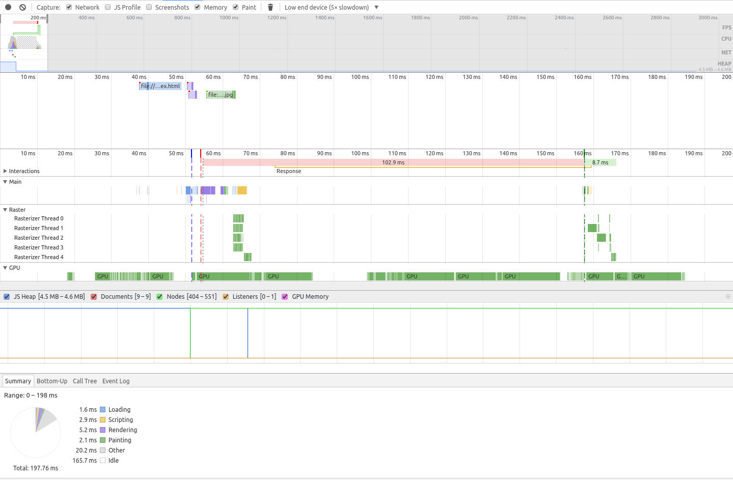
✖ Cross Browser Support
Supported in all major browsers, with the exception of Opera Mini.✔ Performance
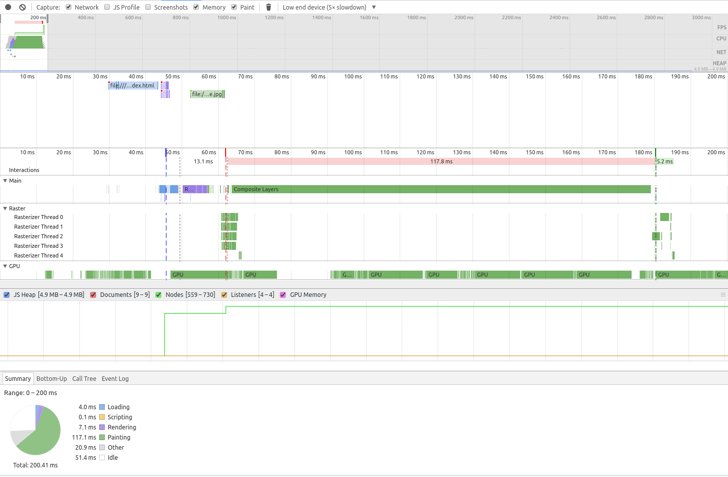
👑 The fastest result! 2.1ms
CSS Shapes
✖ Simple CSS
.separator {
  position: relative;
  width: var(--width);
  height: var(--height);
}

.separator::before {
  position: absolute;
  content: "";
  width: 100%;
  height: 100%;
  background-color: var(--top-color);
  clip-path: polygon(100% 0, 0 0, 0 100%);
}

.separator::after {
  position: absolute;
  content: "";
  width: 100%;
  height: 100%;
  background-color: var(--bottom-color);
  clip-path: polygon(100% 0, 0 100%, 100% 100%);
}
Reversed
.separator.reverse::before {
  clip-path: polygon(0 0, 100% 0, 100% 100%);
}

.separator.reverse::after {
  clip-path: polygon(0 0, 0% 100%, 100% 100%);
}
Reversed Vertical
.separator.vertical.reverse::before {
  clip-path: polygon(0 0, 0% 100%, 100% 100%);
}

.separator.vertical.reverse::after {
  clip-path: polygon(0 0, 100% 0, 100% 100%);
}
Notes:
- 👎 Requires the use of generated content
- 👍 The angle is controlled by the element height value
- 👎 Further control is limited (e.g. creating a shadow effect using
box-shadow)
✖ Generated Content
Cannot be used with the ::before and ::after pseudo-elements as it relies on them already to generate the HTML content for the separator.
✖ Cross Browser Support
✖ Performance
SVG Background Image
Note: The Pen is only an example of embedded SVG DataURI, for more examples (external SVG file, SVG Shadow) check out the repo
❓ Simple CSS
This is not as straightforward to determine, here’s why:
- ✔ Simple = using one variant and external SVG image
- ✖ Not = embedded SVG as a Data URI requires character escaping and encoding
.separator {
  width: var(--width);
  height: var(--height);
  background-image: url(diagonal.svg);
  background-repeat: no-repeat;
  background-size: 100% 100%;
}
Reversed
.separator.reverse {
  transform: rotateY(180deg);
}
Reversed vertical
.separator.vertical.reverse {
  transform: rotateX(180deg);
}
<svg xmlns="http://www.w3.org/2000/svg" viewBox="0 0 100 100" preserveAspectRatio="none">
  <polygon fill="#f44336" points="100 0, 0 100, 0 0"/>
  <polygon fill="#2196F3" points="100 0, 0 100, 100 100"/>
</svg>
Notes:
- 👍 The svg image can either be an external file or embedded as a Data URI for a pure CSS approach (see repo for an example)
- 👍 The angle is controlled by the element height value
- 👍 Full control of element & SVG shape (e.g.: creating a shadow effect in SVG)
- see repo for an example
- 👎 Must create an SVG image for every color and directional variant
- 👋 Better suited for use as an embedded SVG with a CSS Preprocessor to easily create variants
- see repo for an example
✔ Generated Content
Can be used with the ::before and ::after pseudo-elements to generate HTML content for the separator without directly modifying your DOM.
Example
section {
  ...
}

section::after {
  content: '';
  display: block;
  width: 100%;
  height: 50px;
  background-image: url(diagonal.svg);
  background-repeat: no-repeat;
  background-size: 100% 100%;
}
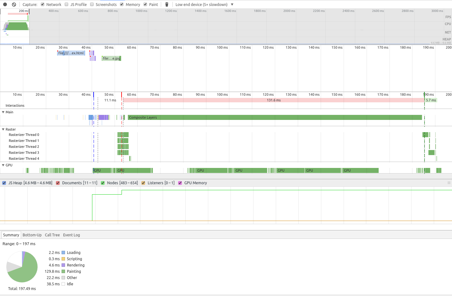
✔ Cross Browser Support
✔ Performance
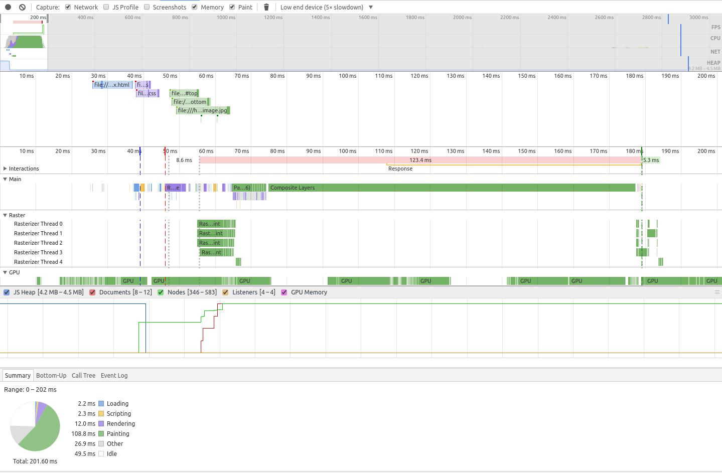
👑 Surprisingly, this came in second to Gradients method in terms of paint speed, despite the page having more complex examples and varieties! (see repo)
SVG Mask
✖ Simple CSS
.separator {
  position: relative;
  width: var(--width);
  height: var(--height);
}

.separator::before {
  position: absolute;
  content: '';
  display: block;
  width: 100%;
  height: 100%;
  background-color: var(--top-color);
  mask-image: url(diagonal.svg#top);
  mask-size: cover;
}

.separator::after {
  position: absolute;
  content: '';
  display: block;
  width: 100%;
  height: 100%;
  background-color: var(--bottom-color);
  mask-image: url(diagonal.svg#bottom);
  mask-size: cover;
}
Reversed
.separator.reverse::before {
  mask-image: url(diagonal.svg#top-reverse);
}

.separator.reverse::after {
  mask-image: url(diagonal.svg#bottom-reverse);
}
Notes:
- 👎 Requires the use of vendor prefix
- 👎 Requires the use of generated content
- 👍 The angle is controlled by the element height value
- 👍 The svg image can either be an external file or embedded as a Data URI for a pure CSS approach
- 👍 Full control of element & SVG shape
- e.g. creating a shadow effect in SVG
- see
shadow.svgfor an example
✖ Generated Content
Cannot be used with the ::before and ::after pseudo-elements as it relies on them already to generate the HTML content for the separator.
✖ Cross Browser Support
Note:
- The example in above uses SVG Fragments to display two colors in the separator
- consult the browser support matrix before using.
- alternatively, you can just use one triangle svg and manualy control the position of the transparent separator
✖ Performance
CSS3 2D Transforms
✖ Simple CSS
:root {
  --vertical-angel: 108.5deg;
  --horizontal-angel: 18.5deg;
}

.separator {
  width: var(--width);
  height: var(--height);
  overflow: hidden;
}

.separator::before {
  display: block;
  content: '';
  width: 100%;
  height: 100%;
  background-color: var(--top-color);
  transform: skewY(calc(-1 * var(--horizontal-angel)));
  transform-origin: bottom left;
}

.separator::after {
  display: block;
  content: '';
  width: 100%;
  height: 100%;
  background-color: var(--bottom-color);
  transform: skewY(calc(-1 * var(--horizontal-angel)));
  transform-origin: bottom left;
}
Reversed
.separator.reverse::before,
.separator.reverse::after {
  transform: skewY(var(--horizontal-angel));
  transform-origin: bottom right;
}
Vertical
.separator.vertical::before,
.separator.vertical::after {
  transform: skewY(var(--vertical-angel));
}
Reversed Vertical
.separator.vertical.reverse {
  position: relative;
}

.separator.vertical.reverse::before {
  position: absolute;
  transform: skewY(calc(-1 * var(--vertical-angel)));
  transform-origin: bottom left;
}

.separator.vertical.reverse::after {
  position: absolute;
  transform: skewY(calc(-1 * var(--vertical-angel)));
  transform-origin: top right;
}
Notes:
- 👎 Must calculate desired angle manually
- 👎 Must set corrosponding element height value manually
- 👎 Requires the use of generated content
- 👎 Further control is limited
- e.g. creating a shadow effect using
box-shadow
✖ Generated Content
Cannot be used with the ::before and ::after pseudo-elements as it relies on them already to generate the HTML content for the separator.
✖ Cross Browser Support
Supported in all major browsers, with the exception of Opera Mini.✖ Performance
Diagonal Separators are just one of many design styles, what should I tackle next? Tweet me with suggestions!


